P1 — Branding Redesign
Mirror
Palais
A full visual identity redesign for a French-inspired luxury fashion brand — from brand system to digital experience to experiential concept.
A full visual identity redesign for a French-inspired luxury fashion brand — from brand system to digital experience to experiential concept.
Mirror Palais is a French-inspired luxury fashion brand with a strong romantic sensibility — draped silhouettes, feminine detail, and an editorial point of view that references Old Hollywood glamour. The existing brand, while evocative, lacked the visual cohesion and digital sophistication to compete at the level its product quality deserved.
This project was a comprehensive branding redesign: a full identity overhaul that preserved what made Mirror Palais distinctive — the femininity, the theatricality, the sense of private luxury — while elevating it into a brand system that could scale across digital products, marketing campaigns, and in-person experiences.
The work encompassed a new visual direction, a refined typography and color system, a UI/UX redesign for the brand's digital presence, and a luxury event concept designed to deepen brand affinity and drive organic social reach.
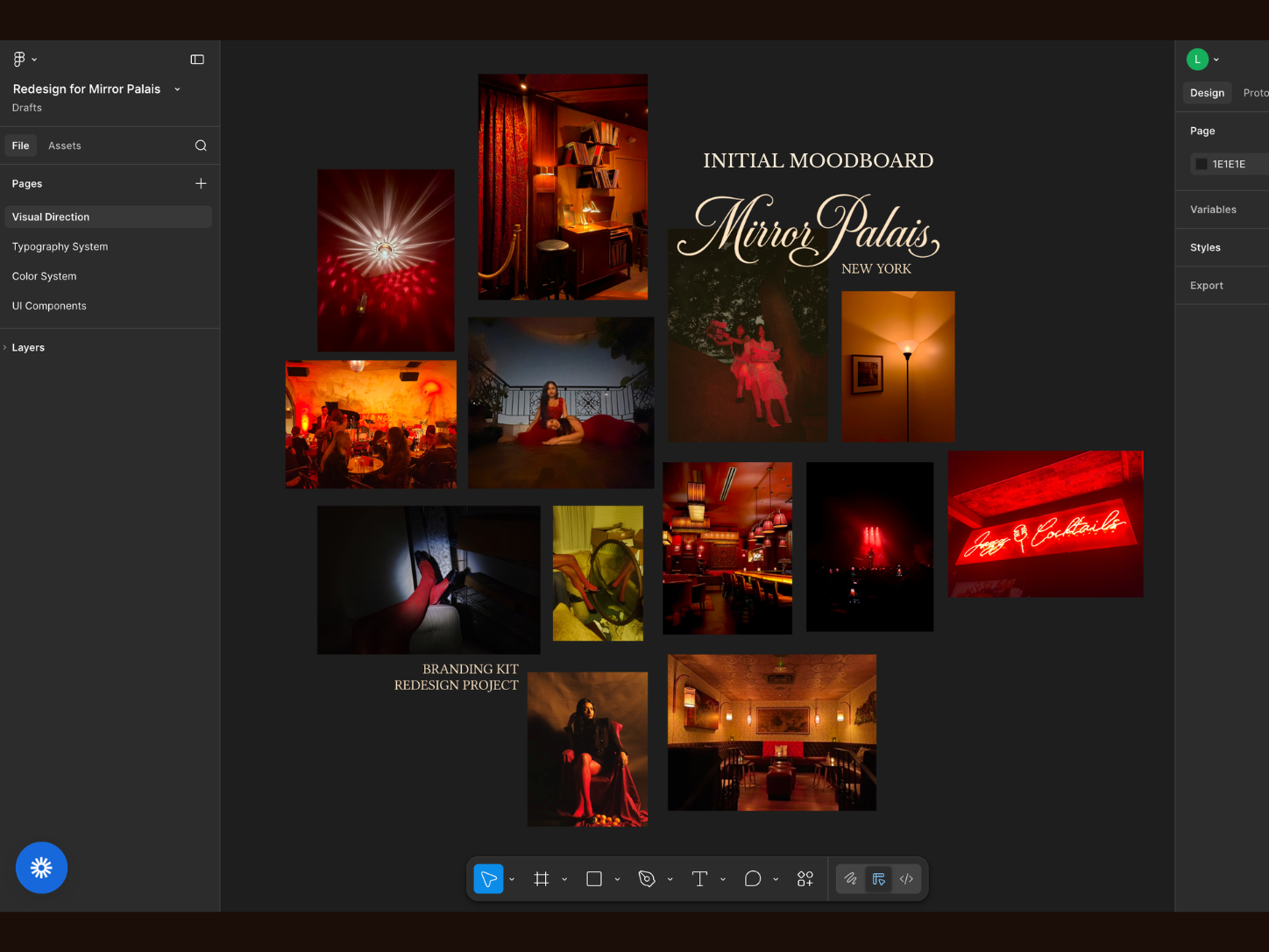
The moodboard anchored the redesign in a specific emotional register: low candlelight, velvet textures, deep crimson interiors, and the charged atmosphere of a private Parisian supper club. Every reference was chosen to define the temperature and weight of the new brand.
The visual research identified three dominant tonal references: the warm amber of candlelit private dining rooms, the saturated crimson of velvet upholstery and neon signage, and the cool blue of evening balcony light — three moods that the brand could move between depending on context and product category. These references were translated directly into the color system developed in the next phase.
The redesign established a complete visual language: a revised logo lockup, a signature monogram, decorative motifs, a refined type hierarchy, and a color system built from the moodboard's three tonal registers.
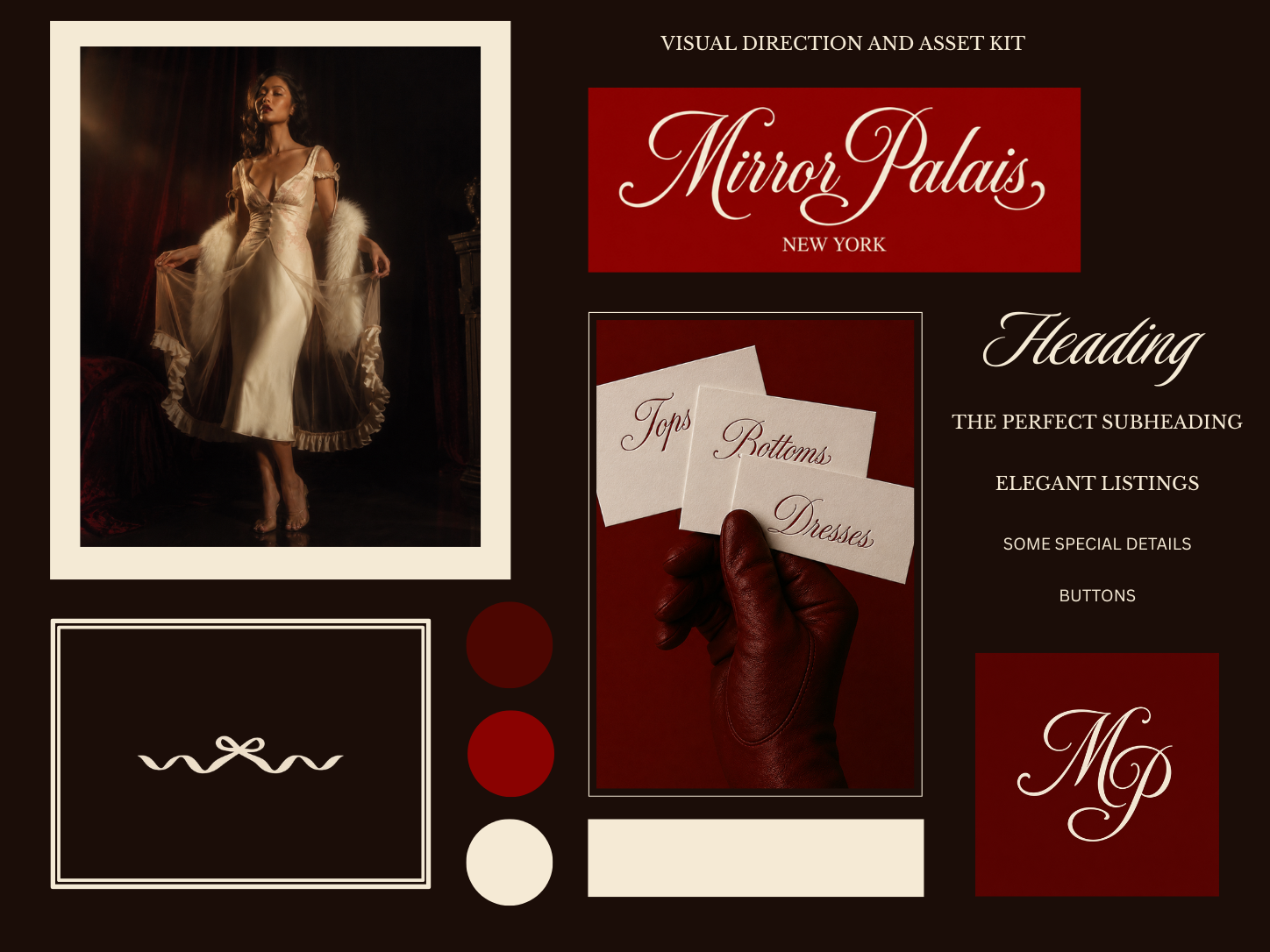
Logo, monogram, color system, typography, decorative motifs
Script logo lockup · "MP" monogram · Satin bow mark · Ornamental border system · Ivory card system for product labeling
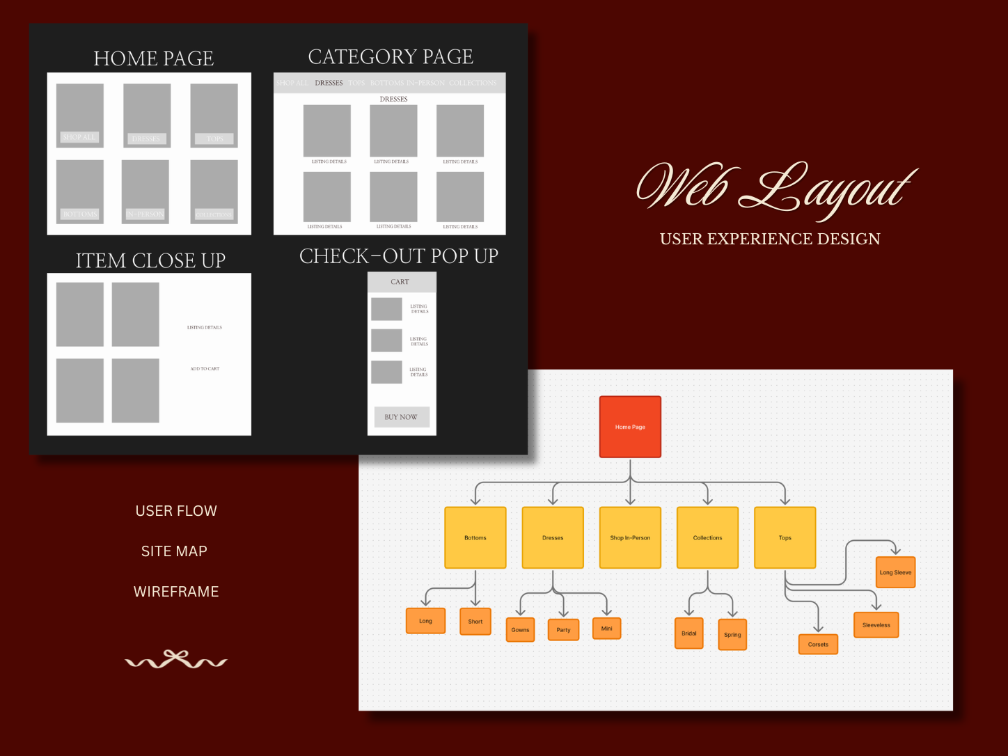
The existing Mirror Palais website lacked clear category navigation, an intuitive product discovery flow, and the editorial visual weight the brand earned. The redesign addressed all three — through a new information architecture, elevated layout system, and a checkout experience that matched the brand's luxury positioning.
A new sitemap reorganized the navigation around five primary categories — Bottoms, Dresses, Shop In-Person, Collections, Tops — each with defined subcategory logic. The hierarchy was designed to reduce decision fatigue while surfacing the brand's strongest product categories first.
The redesigned homepage uses a 3×2 editorial grid to lead with product category imagery rather than campaign photography, giving new visitors immediate access to product browsing while retaining the brand's visual richness through full-bleed imagery and selective typography.
Category pages use a clean grid with generous white space and large product photography. Item close-up pages prioritize image surface area and minimize visual noise around the "Add to Cart" action — a deliberate UX choice informed by luxury retail benchmarking.
The checkout pop-up was redesigned as an elegant slide-in panel — a cart summary that preserves context, reduces drop-off at the final conversion step, and maintains the editorial feeling of the brand through restrained typography and ivory-toned UI elements.
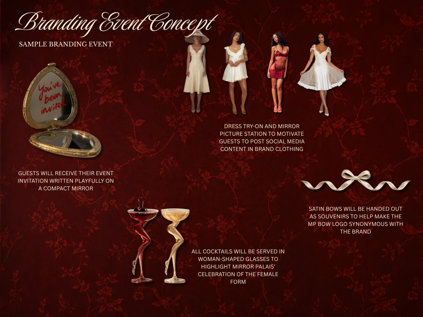
A brand is not only what it puts on a screen — it's what it makes people feel in a room. The event concept extended the Mirror Palais brand into physical space: a curated experiential activation designed to deepen brand loyalty, generate organic social content, and make the brand's aesthetic unmistakable in person.
Event invitations were designed to arrive as compact mirrors — each one handwritten with "You've been invited" in Mirror Palais' signature script. The object itself became the first brand touchpoint, transforming a logistical detail into a collectible moment.
A dedicated dress try-on station allowed guests to wear pieces from the current collection and photograph themselves in a branded mirror environment — designed to generate high-quality organic social content while giving guests a personal relationship with the product.
Satin bows — a key element of the redesigned brand mark — were distributed as take-home souvenirs. The gesture created an ongoing brand presence beyond the event, making the bow motif synonymous with Mirror Palais in the minds of guests and their social audiences.
All cocktails were served in woman-shaped glassware, a deliberate nod to Mirror Palais' celebration of the female form — transforming a functional detail into a brand statement that guests were compelled to photograph and share.
Every element of the event was designed as a content opportunity: the mirror station, the sculptural glassware, the bow accessories. The activation was structured to generate brand impressions that would outlast the event itself through attendee-created content.
The event concept was designed around a single strategic premise: the most effective luxury brand marketing doesn't announce itself — it surrounds people with the feeling of the brand until that feeling becomes a memory.
Logo system, monogram, decorative motifs, color palette, type hierarchy, usage guidelines
Sitemap, user flow, wireframes for homepage, category, product, and checkout pages
Campaign-ready visual components, editorial layout templates, brand photography direction
End-to-end luxury activation concept with invitation design, spatial experience, and content strategy
What this project reinforced is that brand redesign is as much archaeology as invention — the most important early work was identifying what Mirror Palais already was at its best, and designing a system around that essence rather than replacing it. The crimson, the femininity, the theatrical quality: those weren't problems to be solved. They were the foundation to build on. The redesign's job was to give those qualities sharper edges, clearer language, and a digital experience worthy of them.