P5 — UI/UX Design

Daffodils
Wellness
App

A gentle mobile companion for PTSD healing through art — transforming drawing, reflection, and place-based discovery into a soft, supportive daily practice rooted in expressive therapy.

TypeUI/UX Concept — Mobile App
DisciplinesUX Research · User Flows · Lo-Fi Wireframing · Visual Design System
AudiencePTSD recovery — individuals using art therapy as a healing modality
Key FeatureDrawing pad · Mood log · Art museum map · EMDR resources
Overview

Art as Medicine

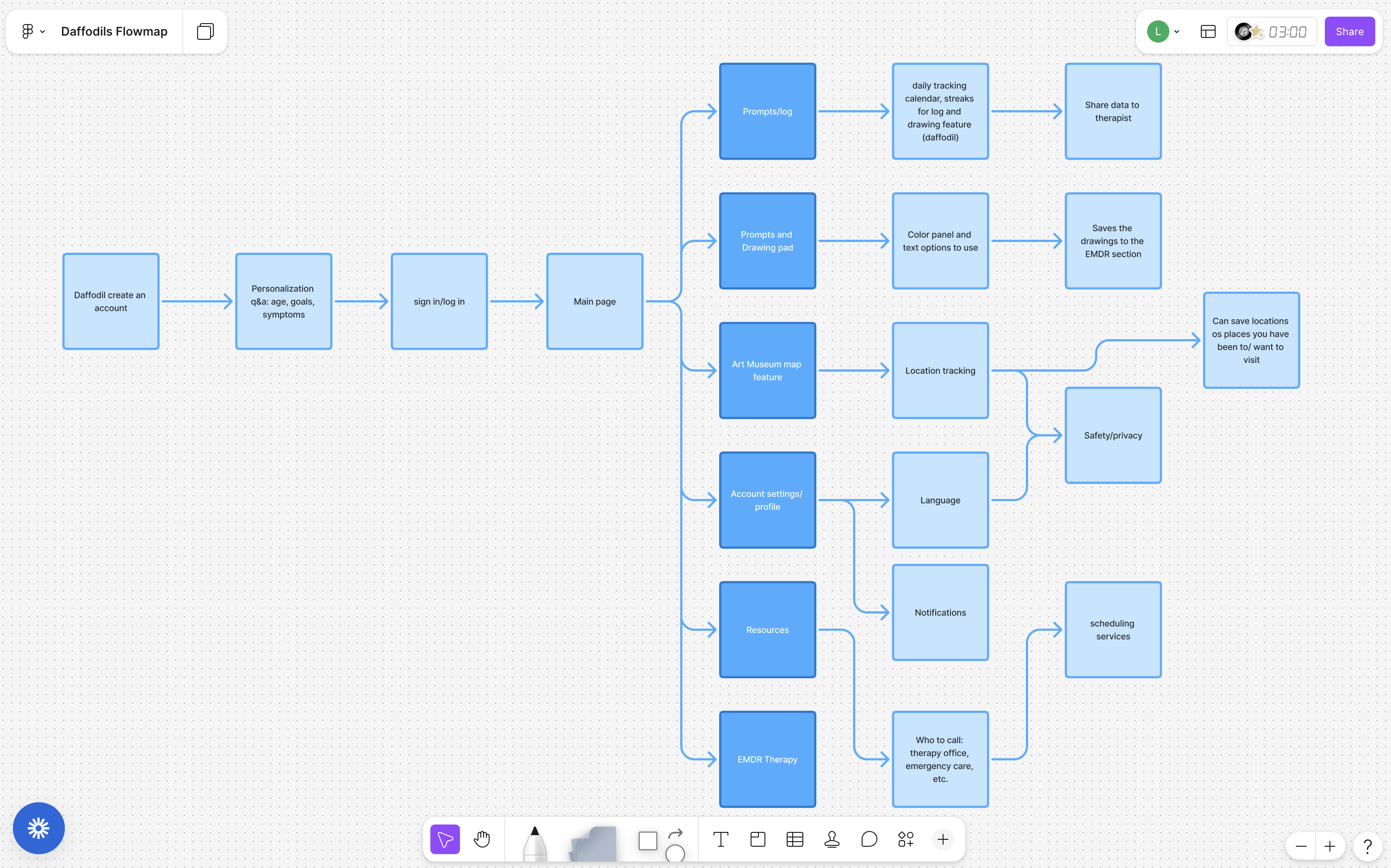
Daffodils began with a question: can a mobile app hold space for healing the way a good therapist does — gently, without judgment, and with the right prompt at the right moment? The project explores art's clinical role in PTSD recovery, specifically how drawing, reflection, and exposure to art environments can support emotional processing and nervous system regulation.

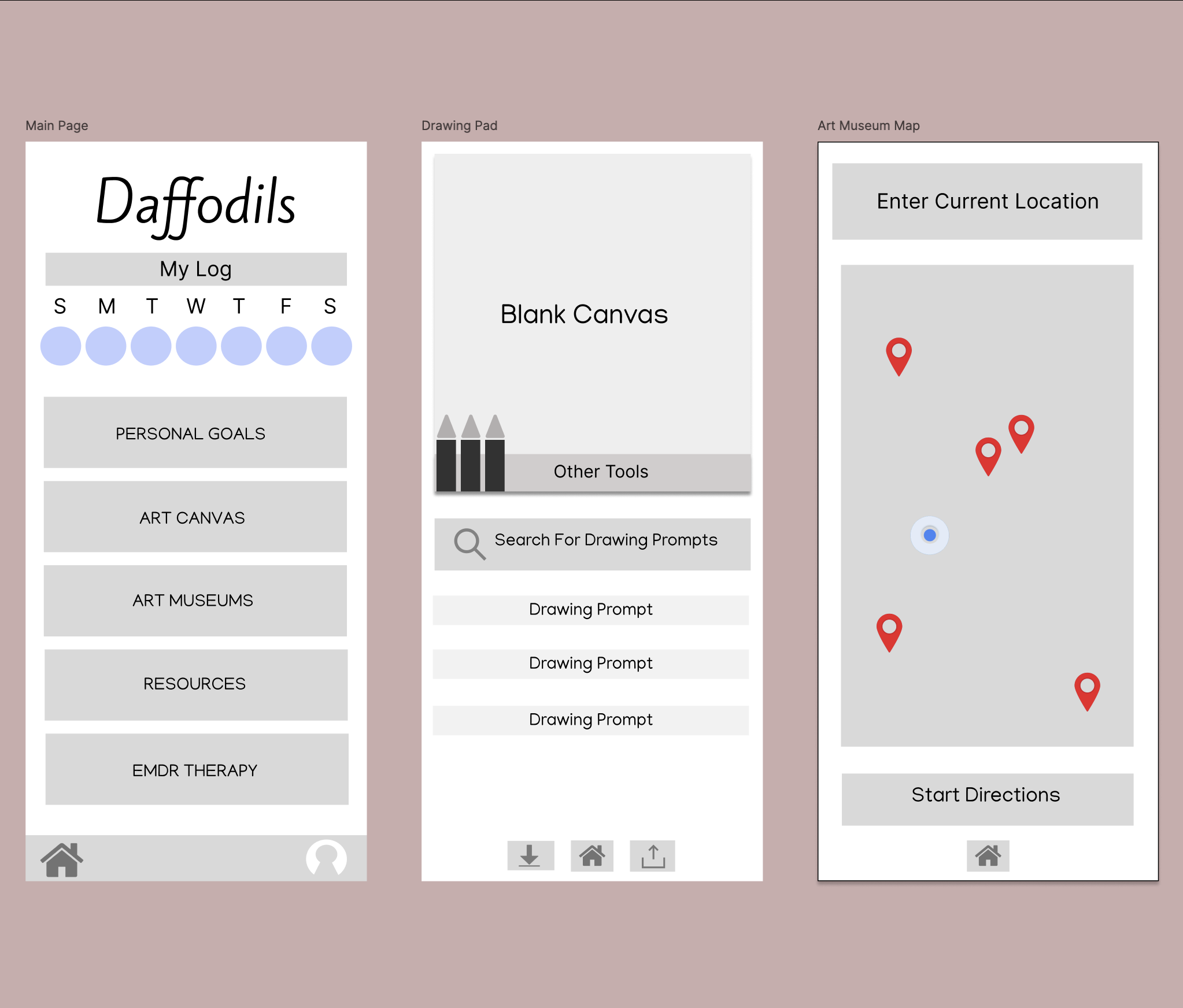
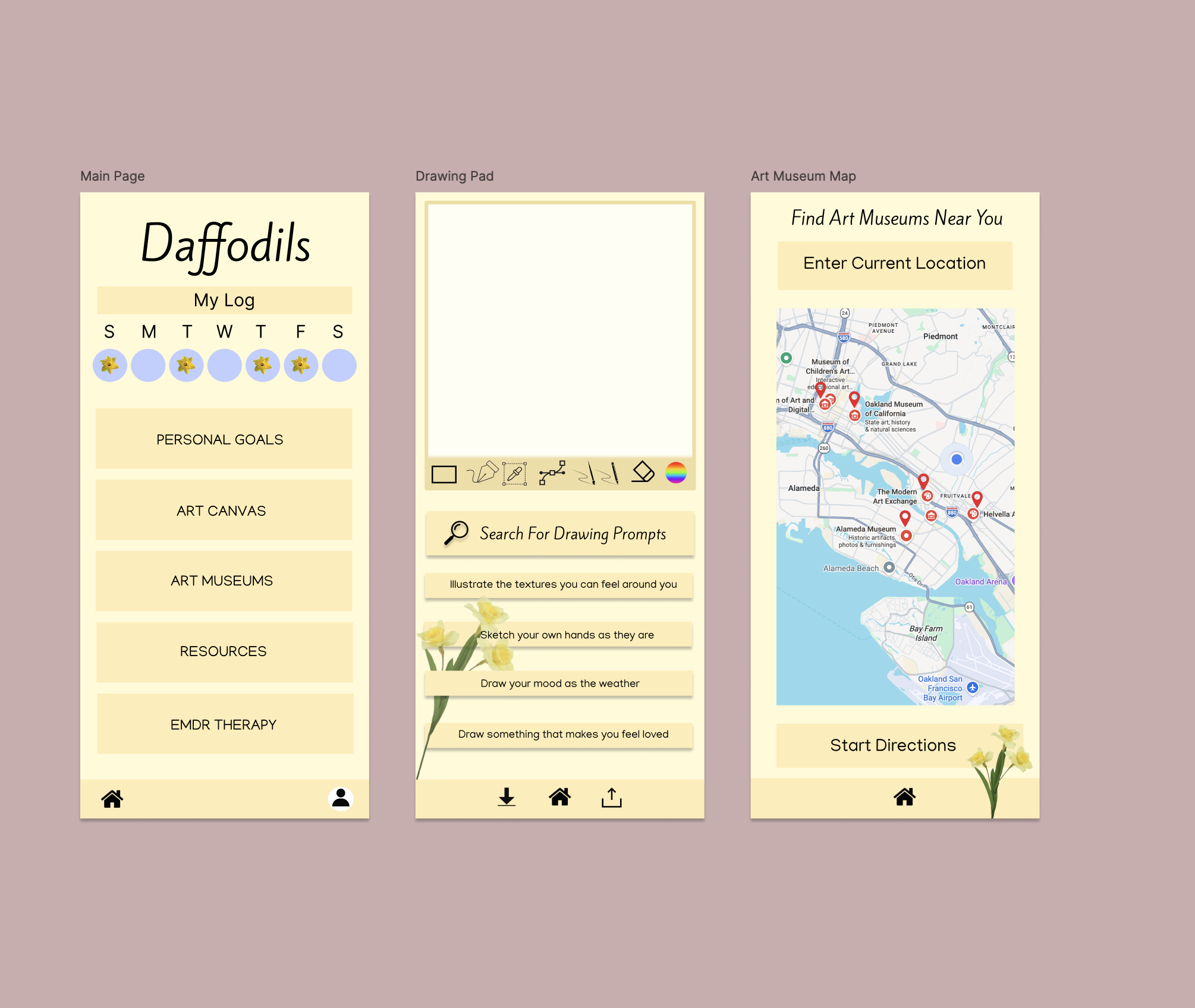
The design process moved from user persona research and journey mapping through low-fidelity wireframing to a fully resolved high-fidelity visual system — a daffodil-yellow, soft-edged interface that communicates safety and warmth from the first screen.

Daffodils low-fi wireframes
Daffodils hi-fi screens
User Flow

The Journey Through Daffodils

1
Create Account — Personalization Q&A captures age, goals, and symptoms to tailor the experience from the first session.
2
Main Page — Daily log tracker with streak system, navigation to all five core modules: Personal Goals, Art Canvas, Art Museums, Resources, EMDR Therapy.
3
Art Canvas — Drawing prompts pulled from a curated library, color panel, freehand tools. Completed drawings can be saved to the EMDR section for therapeutic review.
4
Art Museums — Location-aware map surfaces nearby museums and galleries. Places can be saved, visited, and logged — building a physical art engagement practice alongside digital.
5
EMDR & Resources — Provides structured EMDR session support, therapist data-sharing, emergency contacts, and scheduling links for professional care.
Daffodils user flow diagram
Core Features

Designed for Sensitivity

Feature 01

Daily Mood Log

Streak-based tracker with daffodil badges that reward consistency without shame. Weekly log visible at a glance — progress without pressure.

Feature 02

Art Canvas + Prompts

A blank canvas with contextual drawing prompts — "illustrate the textures you can feel around you," "sketch your own hands as they are" — designed to lower the barrier to expressive mark-making.

Feature 03

Art Museum Locator

Location-based discovery of nearby art spaces. Marks places visited and saved — creating a personal map of art engagement as part of the healing practice.

Feature 04

EMDR Support Module

Structured resources for EMDR therapy including session drawings, therapist data sharing, emergency care contacts, and scheduling tools — bridging clinical care and daily digital practice.

Visual Design System

Yellow as Warmth

The visual system draws from the daffodil's intrinsic symbolism — renewal, resilience, the bloom that comes after difficulty. The warm yellow palette, rounded forms, and generous white space communicate that this is a safe environment before a single word is read.

Typography uses a script wordmark for the app name (human, handmade) alongside clean sans-serif body text (readable, calm). Icon system uses simple, non-clinical line weights.

Petal
Bloom
Daffodil
Stem
Sky

Daffodil illustration elements appear throughout the UI as grounding motifs — in empty states, as streak rewards, and as decorative anchors at screen edges.

The hardest design work is for the moments when someone is already overwhelmed. Every choice has to earn its place.

Daffodils taught me that designing for vulnerable users demands a different kind of discipline. Every interaction pattern, every piece of copy, every color choice had to pass one test: does this make someone feel safer, or does it add friction to a moment that's already hard? That constraint made me a more precise designer.